If you ask obit writers, they'll tell you that more people die between Christmas and New Year's than any other week of the year. According to those scribes who begin each work day by reporting on the last days of others, many people hold out for one more Christmas before they go. Can you blame them?
This may have been this case with James Brown
(See yesterday's BFD), and Gerald Ford.
Most papers led with the story of Gerald Ford's death. Some played it 6-columns wide, while others squeezed into a one-column hole – probably because they already had too much invested in a four-column "centerpiece" – which doesn't speak highly of their news judgment.
According to Ohio University's Julie Elman, "A president passing away is a significant event in
the United States. And it's the job of the visual journalist to convey this
to the reader. This is where the "
show, don't tell" part of the designer's
job comes into play. Yes, the Gerald Ford story broke late – but not so late that pages (even on
the East Coast) couldn't be entirely reworked so that this story had a more
prominent presence out front. With some strong picture editing and headline
writing, any size package could have hefty impact."
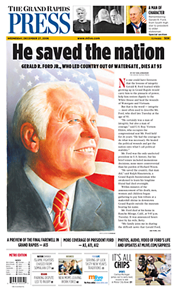
The Grand Rapids Press had the best presentation of this story. One could argue that the Press should have had the best presentation because of Ford's close ties to Grand Rapids. But any Michigan paper could claim Ford as their own. The Detroit papers are both design powerhouses, still the Press did the best job.
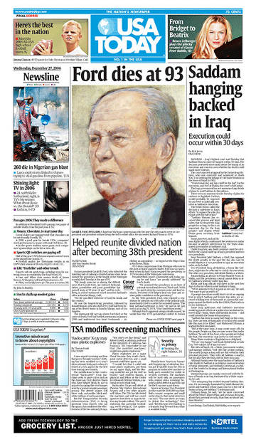
Most papers used a photograph of Ford as the primary visual. But we shouldn't always assume that a photograph is always the best kind of image for every story. The Press used a lovely, uplifiting illustration of Ford, bathing him in a heavenly light which was perfect for this occasion. Illustration can be tricky. If it isn't handled with care, it can detract rather than add to the overall effect, as was the case with this
uncharacteristically unappealing rendering from USA Today.
The Press broke from the pack in two other, important ways. Their headline "He saved a nation," was far more evocative and on point than most newspapers – many of which said nothing more than "Ford dead at 93." The Press went a step further by integrating photos of Ford in their nameplate from pivotal points in his life, including his highly touted college football career.
Room for improvement: Short of picking nits, there isn't much room for improvment, other than this: The Press could have taken a bit more care to mind the fold for single-copy presentation. Ford probably appeared to be "peeping" out of the box all over Grand Rapids.

• Have a nomination for the next BFD?
Send it here with your reasons why.
•
See previous BFD pages in the archives
Comments from John Tomac, Staff Artist, The Record:
I love illustration. I wish newspapers would use more. I think every paper would benefit having an illustrator or two on staff in addition to a large stable of freelancers. I love that the Grand Rapids Press went with a big illustration. However, I don't think the artist here nailed the likeness of Mr. Ford. Just looking at the image itself without the words I don't know if I would instantly recognize the face. The artist appears to have given the former President a little too much hair. Perhaps it was an attempt to show Mr. Ford as a younger man, but it can't be because the hair is too white suggesting he is older. Additionally, the proportions of the head are slightly off, the ear is too high, the head too wide. These problems probably could have been avoided with better reference and a little more time drawing to really nail the likeness. I do agree that the heavenly lighting and flag are nicely done and quite appropriate. However, I don't think I could have bestowed best front on this page simply because the execution is not strong enough. To me, this page looks like a great amount of time was put into the layout and design, but the illustrator provided an image that looks rushed. It is a valiant effort, but I think it just missed it.


