|
|
|
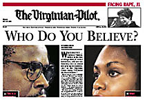
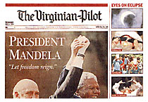
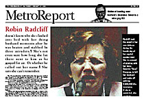
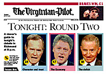
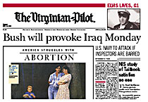
From DESIGN magazine, Fall 1994 Keeping it afloat Maintaining the design at The Virginian-Pilot By Brian Stallcop, News Editor On Nov. 15, 1993, The Virginian-Pilot, in Norfolk, Va., launched a major redesign. The newspaper changed its entire philosophy of news presentation, and it adopted new technology to make the design possible. Here are the highlights of the design process, from philosophy to implementation and the re-tooling that went on along the way. We set these goals before the first prototype was designed: Reader-oriented goals: The design must be accessible, expressive, consistent and self-evident. Staff-oriented goal: The design must be flexible. How do we meet these goals? It's a fine balancing act, but we do it by using the following philosophy: Content drives design. Design choices - in organization, art, typography, etc. - reinforce the content instead of being imposed upon it. If designers do their jobs well, the design is invisible and there are no bells and whistles that don't add value for the reader. Emphasize the news of the day. One way to guarantee that content drives design is to emphasize the news. Story selection stresses the major news of the day, and the front page should be dominated by the top news story. Some days we have single-topic section fronts. On other days we try to find a home for six or seven strong stories. Edit, edit, edit. Editors must not be afraid to edit. Readers expect us to make intelligent choices for them. We must give readers more choices on how to absorb information, not simply more choices of information. The design starts with big words. Big words are headlines, drop heads, cutlines, bold lead-ins, graphic titles and the like. We know that readers look at pictures, graphics and big words before they look at stories. We place a lot of emphasis on the words we know people read, in hopes that they'll read the story, too. If the big words fail, the design fails. We encourage designers to read the stories carefully and write suggested headlines at the beginning of the design process, not the end. That helps us focus on what the story really is and guides the presentation. And designing on the Mac allows designers and copy editors to see the words and pictures together. Establish dominance. Make the top of the page dominant in type and art. Use text as a subordinate element in design. Some days, a section front will be mostly art. On others, mostly text. On still others, mostly graphics. Whatever tells the story the best. Use big words big, in headlines, text blocks, graphics, promos and everywhere else. Look for parallelism in content and emphasize it within the design. Look for parallels everywhere - in content, typography, art elements and headlines. Treat similar elements in similar ways, from stories to photos to headlines to logotypes and other devices that help readers move through packages. The goal is to create an immediate visual relationship for the reader - before they've read a single word. The "pod" The "pod" is an informal gathering at 2:15 p.m. every day attended by the page one designer, a photo editor, an artist, the day metro editor, the wire editor and a deputy managing editor. It's like a budget meeting, but it focuses entirely on page one and is held around a Macintosh computer in the newsroom. A tentative story lineup and lead story are determined. The designer then has until 4:15 p.m. to pull together enough pieces to present a rough draft of the front page at the afternoon budget meeting. Design tips for reporting team leaders (or, how to help designers help you look good.) Attend a pod session. Watch the designers at work. The more ideas, the better. Turn in your copy on time or even a little early. The success of the design depends on the ability of the designers to glean display ideas from your stories. But they can't brainstorm ideas until they see the copy. Think of a visual hook for each story. One principle of the design is that we do something special visually with each section-front story. Traditionally, we've let photos and graphics carry the freight on centerpiece stories, and dressed up the others with a mug shot here or there. That's not enough anymore. Here are a few options: He said/she said boxes, bio boxes, background boxes, quotes, bold lead-ins (to be reserved for really great writing), maps, graphics, photos, etc. If you don't think of a visual hook, the designers will. Which brings us to the next point. Be open-minded. Even if you've held a maestro session and thought of a way to make your story stand out, the designers may have even better ideas. Or they may have to make adjustments to accommodate the other stories on the page. Think parallelism. When we present two or more stories on a single subject, we need to let the readers know that the stories are related. Placing them next to each other or in a box isn't enough. Designers have lots of tools to make stories parallel in presentation, including typography, photography and color. But it's a lot easier to execute when parallel presentation is planned from the start. Give your sources a voice. No, that doesn't automatically mean a row of mugs and quotes. But it does mean letting your sources speak more directly to the reader. If you have a great quote, or a pair of contrasting quotes, be sure to bring it to the attention of the designers. We'll try to incorporate them into the design. Training Then: Before we launched the design, designers received four days of QuarkXPress training. They also participated in several live training sessions, where we produced pages on deadline in parallel with the "real" Pilot. These sessions improved their proficiency in QuarkXPress and in the philosophy of the design. Now: We've experienced some turnover since last year and haven't duplicated the intensive training sessions. Critiques Then: We held critiques almost daily in the first few weeks of the design, but dropped them because we felt they were stifling creativity. Several months without critiques took some heat off the designers - but also allowed us to drift away typographically and philosophically from our design. Now: We've started weekly critiques, with each focusing on one month's worth of pages from one section. Things we've learned not to do Within a few months after launch, designers had discovered most of the"stupid Mac tricks." Here's a list of rules we adopted to clean things up and increase consistency. Do not tilt news photos. Use Daytona (sand), black or white for background colors in quote and act boxes. Do not run headlines over news photos. Use type no smaller than 12-point Franklin Gothic when reversing type out of color. Use no gradients. Use Oxford boxes for major packages, not stand-alone photos or down-page stories. The margin from the box to the content inside is 2 picas. No artwork should cross through an Oxford box. Avoid placing graphics next to photographs. Run local or sports-front columnists down column one or across all six columns at the bottom of the page. Do not run color-tint blocks behind body type. Make quote overlines above six-column heads at least 30 points. Tech talk Color deadlines: Before Macintosh 8 p.m. - The last piece of color is sent to engraving for the first edition. Color deadlines: After Macintosh 10:45 p.m. - Designer sends the last color page for first edition to the RIP. Typographic basics: Headline faces: New Baskerville, Franklin Gothic, News Gothic. Body type: Dutch 811 (Bitstream's Olympian), 9 point on 10 lead. Technology: All section fronts are designed on Macintosh computers using QuarkXPress. Color photos are scanned on AgfaVision-35 scanners and separated in EfiColor Cachet. Color experts from the engraving department work on Macintosh workstations in the newsroom. Stories are written and edited on Atex and converted to XPress formats using JJC's Atan Express. Change at the Virginian-Pilot The design was just one piece of a larger plan to improve the newspaper. Other changes: We lost 30 newsroom positions while adding 10 beats. We replaced traditional desks with reporting and editing teams, including topic-based reporting teams. We flattened our newsroom hierarchy to three layers: Editor, deputy managing editors and team leaders. We've restructured the planning processes for stories, photos and graphics. The design team Alan Jacobson, a Norfolk-based consultant, created the prototypes and worked extensively on training and technical issues. Brian Stallcop acted as the full-time coordinator before the design was launched. He also led the team that planned and implemented the move to digital imaging. |
|