|
|
|
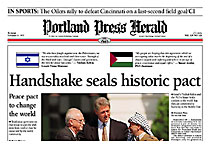
From DESIGN magazine, December 1990 Sitting Pretty Portland Press Herald draws on unusual inspiration for redesign By Warren Watson, Managing Editor We were not the first newspaper to redesign. However, we may have been the first to use a piece of furniture as an inspiration - a simple, wooden chair. The continuous-arm chair is a uniquely American creation. Spare of line and highly functional, the chair would be contemporary but in keeping with the spirit and environment of Maine. The look we achieved, something a reader called "Yankee Progressive," was as much a testament to the 128-year-old tradition of the Portland Newspapers as to the hard work and skill of a number of people, not the least of whom was Alan Jacobson, a talented designer from Norfolk, Va. The redesign, which was launched Aug. 6, was the final link of a 3-year news improvement program at our morning newspaper, the 70,000 Portland Press Herald, and the 155,000 Maine Sunday Telegram. Editorial Directions was the brainchild of Lou Ureneck, our executive editor. The project revitalized a newspaper operation that, one reader said, had become somnolent. We had new staff, new beats, a new sense of mission. But the design was tired, its application inconsistent. I eagerly joined the staff of the Portland Newspapers as managing editor for operations in mid-1988 after four years at the St. Petersburg Times. It took more than a year to get the redesign project under way. Our time was drained by staff development and new initiatives. Our budget was held up as the economy soured. Although I had been anxious to get a redesign started, the delay actually worked to our advantage. Our new staff got settled in and we were able to plan the implementation of the new design to coincide with the opening of our new $43 million flexographic printing facility, set for spring/summer 1990. Our first step, in September 1989, was to form a news committee to plan for and execute the new design. We were joined by Bob Cuzner, director of market research for the Portland Newspapers. The 19 months from my arrival in Portland and the start of the project had allowed me to study the redesign process thoroughly. I had learned one thing well - research had to be the first key step in a redesign. Cuzner would play an important role throughout the project for us, keeping us in touch with our market every step of the way. Our group developed a seven-step plan to carry out the redesign. The first steps - organization, research and goal setting - would be followed by a prototype, format writing, implementation and finally, a design stylebook. Early on, I recommended to Ureneck that we recruit a design consultant to keep us on track and to help solve the technical challenges that crop up in a design overhaul: What type should we use for heads, body copy? What kind of labeling system would we use? Ruling system? That decision led me 1,500 miles away to Fort Lauderdale, Fla., to the 1989 Society of Newspaper Design workshop. It was there that I met Jacobson over dinner at a Japanese steak house. While knives flashed before us, we talked about design, about Portland, about tradition and simple values. Things like functionality. We talked about chairs. We also talked about how the design of newspapers must evolve along with their content, how the content of the Portland Newspapers had outpaced the design. That early meeting and subsequent visits to Portland in November and December helped Jacobson gain a good understanding of our paper, its history and its readers. He talked with our editors. He sampled Portland. We drove through small towns and villages in southern Maine. He was even able to sit in on the first of eight focus groups that Cuzner organized in the next eight months. Behind a see-through mirror, Alan, general manager Steve Braver, key editors, Ureneck and I heard many things. It was evident that readers wanted: Although Ureneck, Jacobson and I saw early on that tradition would have to guide our redesign, there were many in our company who wanted to see a more radical redesign. "We heard an earful that night," says Ureneck of the first focus group in November. "Some (in the company) wanted us to look like USA Today but not after we heard from the readers." The same trends surfaced later, in goals developed by our news committee and in a survey conducted of news staffers. The road to the future of the Portland Newspapers took a sharp detour through our long past. We never lost sight of the chair, a creation of Thomas Moser, a famous local furniture designer. Just as Moser's handiwork was a celebration of wood, our product would be a celebration of the news of the day. The design would not get in the way. Moser even met with us to talk about design concepts. "Design must not blow its horn. It must be subservient to the content," he told us. Jacobson's first Macintosh prototype sketches showed the desire to blend the old and the new. The typeface for headlines would be Berkeley Old Style, a sharp cut of type created in 1938 by typographer Frederick Goudy. It would replace our outdated and inky Satellite. Our body type would be Newstext, increased by 5 percent in size to enhance readability. Our thin box rules would be replaced by horizontal Oxford-style rules - a heritage of our past, but something that would address the needs of the casual reader, someone who does not want to labor over pages, someone who wants to derive information quickly. Our headlines would be supplemented by summary deck paragraphs. The prototype pages were a hit. Not a single major feature would change. Besides the new typography, our redesign stressed functionalism. The newspapers would be easier to use and follow. Some of the enhancements: One of the strongest additions to the front page was a barn-red stripe with the inscription, "Est. 1862." That was the year the Press Herald was born. Jacobson had done his history homework. The project had moved quickly to that point, but problems and frustration settled in with the cold, snowy winter. Jacobson developed area pagination formats to help sustain the design. Early tests were successful. The plan was to come up in April. But setbacks on our front-end CSI system forced us to push back the date three times. A system failure led to postponement of the production of a 40-page prototype in early March; that step finally was pushed back until June. Jacobson spent weeks writing formats only to have to rewrite many when system source-code problems led us to abandon area pagination at the 11th hour. In late winter, we continued to build support for the project in other departments. I developed a slide show and met with groups in production, circulation, advertising and finance. In May, while Jacobson worked with production director John Rodney and his staff on our production difficulties, Ureneck, Braver and I showed off the redesign to our corporate staff and the Guy Gannett family, our owners. A committee of staffers from other departments helped us promote internally. Support for the project continued to build. We set Aug. 6 as the new implementation date. Publicly, I worked with our committee to complete training plans and tie off loose ends. Privately, I doubted it would happen and decided not to make any vacation plans in the fall. It did happen, but not after an interesting weekend leading up to our first newspaper, a Monday edition. For example, the premiere edition of the Food and Health section was to include a feature on stylish gelatin desserts. After photographing the desserts, the camera was dropped. By the time it was realized the film was ruined, the desserts were gone, eaten by other staffers. But we got the first edition out, and the second, and the third. The response from readers was gratifying. People liked the clean appearance and better organization (we now letter our sections). They liked the larger type and color. Detractors focused on the fact we changed. They also focused on the fact we raised the price of the paper from 35 cents to 50 cents on the newsstand. One reader compared our redesign to the Edsel, the Susan B. Anthony dollar and "new Coke." We still have a road to travel. Editors retreat to old habits as we ready to publish our stylebook. Our pressmen are still shaking down problems with the new Flexo technology. But we've added something to the lexicon of our readers, who grew up with journalism's 5 Ws - who, what, where, when and why. Our morning papers now feature the 5 Cs: clean, complete, clear, colorful and compelling. Maybe I need to throw in a sixth C...something about that chair. |
|