|
|
|
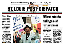
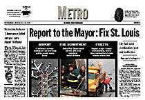
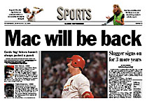
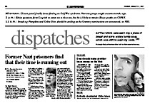
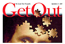
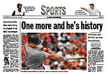
From DESIGN magazine, Spring 1998 Three designs for the Post-Dispatch By Bob Rose, Assistant Managing Editor The St. Louis Post-Dispatch redesign is a story of three designs - one that the editor hated, one that readers hated and one that both loved. It's a story about meeting a deadline despite pleas of much of the newsroom to wave off. And it's a story of how a dedicated crew in the newsroom and prepress teamed to provide the paper with better tools to serve its readers. Part 1: Dessert Cole Campbell took over as the Post-Dispatch's editor in October of 1996. He arrived at a paper that had lost 100,000 daily subscribers in the past decade. After spending a few months observing the operation, he launched his first major initiative - a redesign of the paper. We could have spent years on market research and staff evaluation, but Campbell wanted to be able to move quickly and decisively. The redesign would not be the finishing touch on the overhaul of the paper. It would be a catalyst - establishing better work flows and framing new content initiatives. It would be a first step toward improving the paper. We combined quantitative data from Urban and Associates research with feedback from readers, carriers and community leaders and our own gut instincts. The direction for the redesign became clear: We needed to present a product that was easier to use and better organized. But most important, we need to present a product that was dedicated to news. Both the quantitative and qualitative research was clear. People want news - news about their community and news about people like themselves. We hired designer Alan Jacobson's Brass Tacks Design to do the job. He had a reputation for delivering designs that fit the market. His company had redesigned papers across the country, including The Virginian-Pilot, and provided technical support to many other papers produced on Atex systems, including the New York Times. This redesign process would go beyond merely making the paper prettier. It would reshape the content and revise our work processes from the moment the story was assigned until the paper rolled off the press. Early in the process, each newsroom department took inventory of its content and held meetings to determine what it actually wanted out of the design. Campbell and Managing Editor Dick Weil led a series of meetings for Page 1, Metro, Sports, Features, Business and A section. These meetings provided direction for subcommittees that developed "promises" for each section - a kind of contract with the reader about what each section would deliver. In the meantime, Alan and I worked on the design as well as the content. We prototyped a handful of pages from each of the major sections. Our key goals: While surveying the Post-Dispatch's history, we were continually drawn to the papers from the late 1870s that had short snippets of local news combined with longer "important" stories. The Post-Dispatch was running news briefs long before USA Today. Our own anecdotal evidence supported what other eye-track surveys had shown: Readers will read a short story before they'll read a long one. Out of this thinking our first design was born. It was a design that was never to see the light of day. In our first design effort, we turned down the noise and distractions, toned down the color palette and paid closer attention to headlines. But the biggest change was in content. We anchored a daily 18-inch "read" on each section front. Nothing revolutionary here - The Wall Street Journal and Los Angeles Times had been doing this for years. But the second standing element, Dispatches, was revolutionary. Dispatches were short standalone stories on each section front that told us about the way we live. These were not the news summaries or promos that popped up everywhere in the designs of the '80s. These were self-contained items that aspired to tell us the "what" - the news; the "so what" - what does that mean to me; and the "now what" - what will happen next. All in three to five sentences. In March, we presented the design to our paper's senior leadership group. It flopped. The always articulate Cole Campbell was dumbfounded. He grimaced and shifted and looked uncomfortable as he pored over the pages. The Dispatches, which Alan and I had paid so much attention to, were ignored. Our redesign was all about the content. But no one read our copy. Over the next few days, the senior leadership expressed its reservations about our prototype. "Too much dessert." "Not enough dignity." Campbell's vision for page A1 was news, news, news. There would be no room for the dessert. Elements would appear on section fronts based on their news value, not on how they fit into a preordained template. Said Campbell, "I want a blue-collar New York Times." We headed back to the drawing board. Part II: Homework Everything about the second effort had to do with news. To do so, we threw out the old design conventions that got in the way. Modular layout made us a prisoner of design. We dumped it. Horizontal layout forced us to overplay the importance of some stories. We dumped it. Our upstyle headlines sometimes created confusion. We dumped them. We introduced ruling conventions to organize stories and an intensive headline structure that picked up on the "what, now what, so what" strategy of the earlier briefs. The conventions of the new design were quite retro: This design was more sophisticated, more editing intensive and more difficult to produce than our first attempt. After weeks of prototyping, we had a design ready to test with readers. Campbell loved it; our designers were starting to like it, but our staff was split on it. Some said the multi-deck heads and non-modular makeup made reading the paper "like homework." The advertising agency hired to promote the design was taking a defensive posture. Fearing a negative reaction at launch, they created a campaign emphasizing the notion that "change is good for you, even if you don't like it at first." Even Alan and I disagreed. He said he didn't believe the design capitalized on this opportunity to reshape the Post-Dispatch. Despite the reservations, we pushed ahead and produced a complete A section to be shown to six focus groups. We got hammered. Not by everyone, but by too many. During one focus group, the moderator asked in desperation, "Some very smart people worked very hard on this and thought it was better. What do you like better about the prototype?" They answered, "Nothing." Actually, half the groups hammered us and half preferred our prototype. But we weren't satisfied because the groups who liked us didn't like us enough. We wanted something that was perceived as significantly better by a large majority of readers. We were less than two months away from the November deadline for launch (it had to coincide with introduction of new ad rates and with the best times to buy promotional radio, television and billboards). Virtually every newsroom leader and company vice president was urging a postponement. But Campbell boldly challenged the company leadership. "We have the skill to meet the deadlines; do we have the will?" he asked. Alan and I knew that somewhere between the easy-to-use first design and the news-news-news of the second design was something that was right for St. Louis. We found it by revisiting the comments of readers, carriers and staffers. Part III: More news, easier to read We developed the following principles for our third effort: Provide news, and local news above all else. Local news for readers is defined as "news about me or my community." A TWA story isn't necessarily local even though TWA is based in St. Louis. A neighborhood crime story isn't local if it doesn't relate to me. But an entertainment story is local if it is about a television show I watch. Choose a lead story, signaled by a lead headline. Readers might not agree with our choice, but they want us to tell them what the most important story of the day is. Make an emotional connection with readers. Based on the appeal of our Princess Diana coverage, we reconsidered stories and photos that played to the heart as well as the head. Alan believed most emotional connections are made through photographs, but the newsroom subcommittees had neglected photography in developing their promises for each section. We re-elevated photography to its rightful place in our news judgment standards. Don't waste people's time with "clever" headlines. Heads need to be straightforward and descriptive. They need subjects and verbs. Every headline should give the reader information and help them decide whether they should read the story and not try to seduce them into reading it. We kept the first design's ease of use and pushed the newsiness of the second. We rolled the Dispatches idea of the first design into a new concept - the "powerbar" (see sidebar). We kept the headline conventions of the second design, but went back to a six-column grid. We also introduced some new ways to present the news: Newsmakers: This personal spotlight is not as light as the entertainment package we had run previously on Page A2. Page A3. This half page contains the top three nation or world stories that don't make the front page. The package is anchored and formatted, making it easy for editors to produce and readers to use. Nation and World pages. Each of these two open color pages inside the A section mixes breadth of coverage with depth on one issue in the news. Metro watch: This page inside the Metro section organizes the community and law-and-order news that readers used to find scattered throughout the paper. Alan and I did not want to take any chances with our third attempt at a new design for the Post-Dispatch. We had promised our company's leadership that we would deliver something that readers not only would prefer, but would love. We drafted Post veterans Tom Borgman and Steve Parker, and newcomer Wade Wilson to help us remake an entire paper. And as we did it, we posted each page on a newsroom wall to get immediate feedback, criticism and help from the entire staff. We selected new stories, rewrote headlines, reedited pictures. We adjusted the graybar and retoned all the photos to improve reproduction. Readers and carriers in 14 focus groups loved it. They wanted to take copies of the prototype home. They thought the paper was being printed on brighter stock. They said they didn't need their glasses to read it any more. But there was one concern: some worried that with all this improving, we would have to raise the price. Finally we had the green light we needed to launch a redesign. The marketing department, working under tighter deadlines than anyone else, dropped their defensive campaign and charged ahead with a new campaign touting "More news, easier to read." We used the weeks remaining before launch for final preparation. We adjusted section promises. We changed workflow. We integrated Macintosh workstations with our Atex system, enabling editors, designers, artists and photographers to work collaboratively in ways they never had before. We converted to 100 percent Postscript output and gained two hours on our color deadlines. The Macs also permitted us greater flexibility in zoning color on page A1 for our Illinois edition. We're studying ways to develop a separate single-copy edition too. The first issue of the redesign Post-Dispatch appeared November 3. On that day hundreds called in to tell us what they thought. Almost 3 out of 4 preferred the new design. The redesign has been a big success in the newsroom, too, based on internal interviews conducted by the Harwood Group - consultants to other papers such as The Miami Herald, Orange County Register and Wichita Eagle. The Harwood Group reports that: "Editors and staff say they are proud of the paper's redesign. They say it makes the paper more accessible for readers and has prompted people to work together in more effective ways - for instance, graphic and text journalists are working together for the first time. What is more, they point to the redesign as a sign that the newspaper is beginning to take real steps to improve." If we can win over a newsroom of cynics, winning over readers shouldn't be too tough. |
|