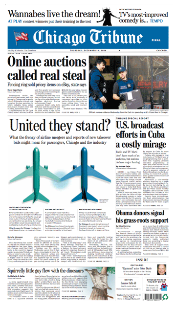
What makes this page a BFD: Unique graphic and clever headline on the airline merger story
Several papers featured stories about pending airline mergers, but the Trib's unique visual solution and clever headline made it the best designed. Part of the challenge was finding a way to show multiple merger scenarios (United & Continental, United & Delta, American & Northwest, etc.) with a single image. Most papers opted for a photograph of a jetliner – but this kind of image doesn't say “merger,” and is too specific to a particular airline. The Trib's solution shows two planes “joining hands,” like a brother and sister or husband and wife. Unlike a photograph, these generic images were not specific to any particular airline, making them representative for all the merger scenarios described in the thoughtfully presented short-form text below.
The headline was particularly appropriate: the airlines are more likely to “stand” if they merge, and likely to fall if they don't. (Maybe “Divided they fall” should have been part of the headline?) “United” is a key word for the Trib because Chicago is United Airlines' base of operations. Changes at United could have a big impact on Chicago.
Room for improvement: The United package is sophisticated in its visual presentation and headline. But this package is an island of creativity on a page that consists of little more than headline-byline-textblock-jumps. The other stories on the page could seem more engaging if the same level of attention was applied.
• Have a nomination for the next BFD? Send it here with your reasons why.
ONLINE NEWSPAPER DESIGN Read Steve Outing's interview with Alan Jacobson and learn why newspaper web sites are seriously flawed. Then see alternatives.
EDITORIAL, CLASSIFIED & ONLINE NEWSPAPER DESIGN Our redesigns are catalysts for positive change. Visit the gallery to see how we've transformed publications and websites. EDITORIAL NEWSPAPER DESIGN
NEWSPAPER DESIGN WHITEPAPER A redesign is a waste of time and money if it doesn't deliver a return on investment. Download our report to learn how to make your redesign pay off, then see how four newspapers boosted readership and revenue by following our advice. TARGETED PUBLICATIONS
INTERACTIVE TOUR See in detail how a content-driven redesign did more than make a community daily look better – it made it a better paper. RADICAL STRATEGIES FOR CIRCULATION WOES
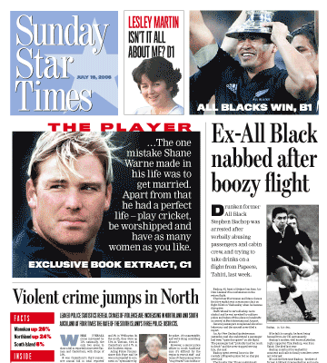
A newspaper war, that is. The Sunday Star Times, New Zealand's largest newspaper, faces fierce competition on the newsstand from two tabloids. So it was redesigned to improve its above-the-fold presentation. The complete story will appear here and in the next issue of SND's DESIGN.
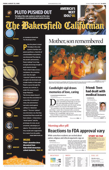
The Californian's redesign earned it a spot on Editor & Publisher's list of “Ten That Do it Right.” According to E&P, Bakersfield is appealing to its “really, really conservative market with a really, really radical redesign.”
And it’s working.
Circulation stops are down and revenue is up – over a thousand inches in the redesigned real estate section alone.
See before and after, see more pages and read the stories.
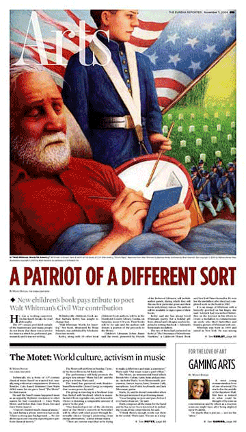
The Eureka (CA) Reporter was just a 6,000-circ. weekly in 2004. Our radical yet elegant redesign helped this startup weekly grow to a daily in less than two years. The Reporter goes head-to-head with an established daily owned by Dean Singleton, who told The San Francisco Chronicle last month that his competitor, “does some good design things.” The Society of News Design agrees – they cited this redesign as one of the best in the world. See more pages.
Len Downie's memo calls for more emphasis on design.>>
Read our abbreviated version of API's report. It'll only take a minute and it's worth it.>>
See the charts that show why now is the time to redesign for revenue.>>
A practical, step-by-step approach with examples from newspapers large and small.>>
Learn from KnightRidder's mistakes at the Inky and the Merc.>>
This online redesign is not enough to please users and advertisers.>>
Design does matter to readers, but only if it's reader driven.>>
If newspaper markets are so different,
why do most papers look so much alike?>>
I wish you luck and offer some advice.>>
This overhyped trend is a non-starter for America.>>
We can make a difference, but not by chasing awards.>>
At stake is nothing less than newspapers as we know them.>>
A thousand awards a year? Gimme a break.>>
They never said higher RBS scores would sell more newspapers.>>