NEWSPAPER ONLINE DESIGN Read Steve Outing's interview with Alan Jacobson and learn why newspaper web sites are seriously flawed. Then see alternatives.
EDITORIAL,
CLASSIFIED &
ONLINE REDESIGN Our redesigns are catalysts for positive change. Visit the gallery to see how we've transformed publications and websites. EDITORIAL REDESIGNS
REDESIGN WHITEPAPER A redesign is a waste of time and money if it doesn't deliver a return on investment. Download our report to learn how to make your redesign pay off, then see how four newspapers boosted readership and revenue by following our advice. TARGETED PUBLICATIONS
INTERACTIVE TOUR See in detail how a content-driven redesign did more than make a community daily look better – it made it a better paper. RADICAL STRATEGIES FOR CIRCULATION WOES
Brass Tacks Design
If the redesign of the Orlando Sentinel is to succeed – and by succeed I mean boost readership and revenue for Mr. Zell's troubled Tribune Company – it will need to concentrate on content rather than cosmetics.
Sure, the Sentinel's editors and designers will serve up the shorter stories, snappy graphics and sizzling color Mr. Zell called for, but cosmetic changes alone have never delivered bottom-line results.
And yes, the new Sentinel looks better – AME/Visuals Bonita Burton and her team deserve credit for the big improvement. But looks aren't everything, or even the most important thing. Many designers seem to disagree with this position. Read about that here.
In these troubled times for newspapers, it's important to note that “readership” and “revenue” are conspicuous by their absence from virtually all the words that have been published about Orlando's redesign. Instead, much has been made of the cosmetic changes to come.
This is not a criticism of Mr. Zell – at least he's pushing his people to do something – but it will take more than eye candy.
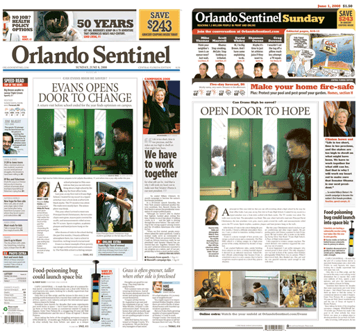
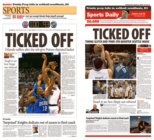
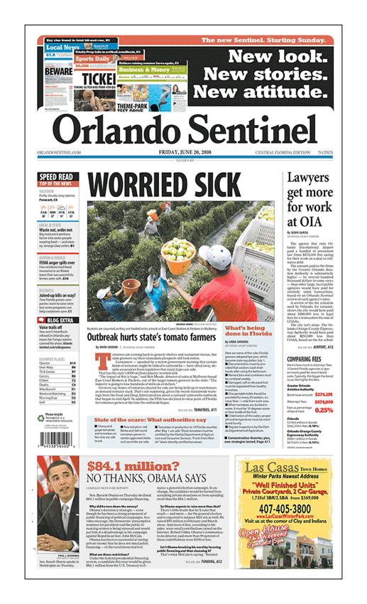
One need only examine the before-and-afters, below, to see that no substantive changes have been made to story selection. In many cases, even headlines and photos remain the same. Time has proven that merely dressing up the same old content will not attract readers' eyes or advertisers' dollars for more than a few days.
Granted, these pages are merely prototypes, and it's possible that a sea change of news judgment will appear in a couple days. But it seems odd that editors didn't test their new editorial philosophy in advance on their prototype pages. Most papers struggle to just live up their prototypes; few exceed them. The experts I consulted agree on that point. So a wait-to-see attitude isn't likely to pay off.
In contrast, before-and-afters from the June 10 redesign of the Wyoming Tribune Eagle show thoughtful changes to story selection, headline writing and use of images that are intended to drive reader interest and single-copy sales. As part of their redesign, the editors of the Tribune Eagle revisited every editing decision they had made on previously published pages. A quick read of all the headlines on the prototypes shows that they produced new pages that are more compelling, interesting, relevant – and fundamentally different – than what they published originally.
Prototypes are created in a controlled setting, where editors can learn how to pick the kinds of stories that drive readership. Orlando's editors missed that opportunity to experiment. And based on last Friday's paper, they still have a long way to go. Let's have a look:
The lead headline says “Worried sick” About what? If this headline is meant to sell the paper, it doesn't do a very good job of it. Granted, the headline beneath the image does a good job of telling the story, but no potential impulse buyer would ever see this headline. Research has shown that single-copy sales are driven by the content of headlines, rather than big images, so it's essential that headlines be clear in their meaning and legible from a distance.
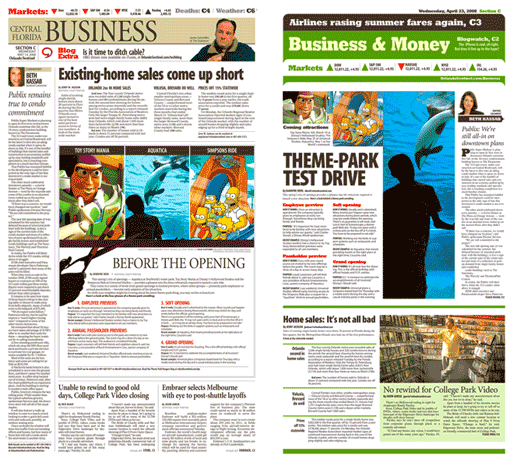
The off-lead reports on excessive fees charged by lawyers. While this story is an excellent example of watchdog journalism, it's not the kind of story that makes people want to pick up the paper. Here's why: This story is important, but it doesn't provide information that most people can act upon. The average, time-starved newspaper reader is hard-pressed to right this wrong. To them, a story like this is important, but not relevant to their daily lives. These readers focus on what they can control and what affects them directly on a daily basis. Research has shown that relevant stories, rather than important ones, drive single-copy sales.
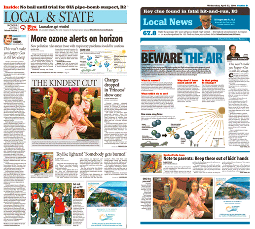
Ironically, there is a “can you believe this?“ story beneath the fold, where it has no impact on single-copy sales. But the report on Obama's campaign funding would be of interest to more people with a better headline. Imagine if the Sentinel had run this 6-column, banner headline: “Who turns down $84 million?” Stories like these are better drivers of single-copy sales. The editors of big-city tabs already know this. Editors on broadsheets should follow their lead to increase sales of their newspapers.
According to orlandosentinel.com, the following things make the redesigned Sentinel better than the old one. But I was able to find all these things in the old Sentinel:
A digest summarizing the top contents of each section
Provocative voices from our signature columnists
Big local stories – watchdog reports (such as last Friday's story about legal fees, above), consumer news, latest trends
A "can you believe this" item (such as last Friday's Omaba story, above)
Information about crime and courts
Big, bold coverage of our area teams
Fast facts about topics in sports
Provocative voices from our signature sports columnists
Based on this list, it's not clear what content makes the new Sentinel better.
Cosmetic redesigns are a waste of time of money. In contrast, content-driven redesigns can be powerful catalysts for positive, substantive changes to newsroom culture, but only when they transcend superficial changes to fonts, color palettes and grids. Recent redesigns in n Cheyenne, Wyoming and Waterbury, Connecticut, and Pocatello, Idaho have boosted readership and revenue, in part because these goals were clearly stated at the beginning of the process and embraced by all hands. These papers aren't big, but unlike their big brothers and sisters, they are innovative – and their redesigns moved the needle.
For instance, here's how Jack Kerwin, a newspaper editor/designer in Daytona Beach, described Cheyenne's redesign:
The words – bigger, cleaner typography – scream out in a very positive way. I wouldn't suggest that I'd stick with a paper just for "look," because I do like to "read" quality material. But, honestly, I rarely come across well-written stories (what I'd consider well-written ... entertaining, descriptive, draw me in). That's the biggest failing on the editorial side of the biz from what I see ... and has been since I've been in it for 2 decades now, basically because, from what I see, the higher-ups keep hiring the same type of writers over and over.
It will take radically different newspapers to shore up sagging circulation and revenue. We can only hope that the people producing today's newspapers have the skill and will to produce tomorrow's fundamentaly different newspapers.
If Orlando's redesign fails, it won't be because it went too far, as Alan Mutter contends. It will fail because it didn't go far enough.
Do 6-column photos boost readership and revenue?>>
Who would have thought that TV books would lead to the end of newspapers as we know them?>>
Len Downie's memo calls for more emphasis on design.>>
Read our abbreviated version of API's report. It'll only take a minute and it's worth it.>>
See the charts that show why now is the time to redesign for revenue.>>
A practical, step-by-step approach with examples from newspapers large and small.>>
Learn from KnightRidder's mistakes at the Inky and the Merc.>>
This online redesign is not enough to please users and advertisers.>>
Design does matter to readers, but only if it's reader driven.>>
If newspaper markets are so different,
why do most papers look so much alike?>>
I wish you luck and offer some advice.>>
This overhyped trend is a non-starter for America.>>
We can make a difference, but not by chasing awards.>>
At stake is nothing less than newspapers as we know them.>>
A thousand awards a year? Gimme a break.>>
They never said higher RBS scores would sell more newspapers.>>