newspaper design
classified design
web design
online design
newspaper redesign
classified redesign
 

MARCH 2006


It's time to redesign
the Society for News Design


Last month the Society for News Design announced the 1,136 winners of their 27th Annual Creative Competition. This is not the first time the number of winners exceeded 10³, which begs the question:

What other organization gives its members more than a thousand awards a year?

The Pulitzer Prize Board gives 21 awards. Does SND believe that the appearance of words is 50 times more noteworthy than the meaning of words? I hope not.

The Nobel Foundation grants six awards for things that are clearly more important than “overall redesign of a regularly appearing newspaper section.”

'Nuff said.

I've been a member of SND from almost the beginning — back when the entire membership was kept on a few dozen 3x5 index cards in a little metal box on Robert Lockwood's desk in Allentown, Pa. As a member, I'm part of the problem. Now I want to be part of the solution, which I believe can be found right at the source.

“The mission of the Society for News Design is to enhance communication around the world through excellence in visual journalism.” These aren't my words - they come directly from SND's website. I assume that “communication” and “journalism” require readers. So let's change SND's competition to support, promote and fullfill that mission — for readers.

Redefine the categories to promote SND's mission of enhancing communication.
Like any redesign, it's difficult to let go of the familiar. SND members are likely to balk at eliminating any of the score of categories created in the past quarter century. But there's nothing preventing us from adding categories that serve readers through design. For instance:
  • “Best anchoring of regularly appearing features” (comics, crossword, obits, etc.)
  • “Overall design of locator maps”
  • “Easiest to navigate”
  • “Best sports agate” (When's the last time a designer asked for this onerous redesign task?)
  • “Most organized”
  • “Most informative weather package”
  • “Best digest”
  • “Most innovative use of short form”
  • “Best packaging of a 200-inch story that even the reporter's mother won't read”
  • “Most legible bodytype”
If SND gives awards in these categories, I bet newspapers will get more of the kind of design that really matters to readers. And the competition will promote SND's mission.


Reduce the number of awards to a meaningful number.
Let's begin our search for a better way to honor our peers by looking to NPPA - the National Press Photographers Association. Like SND, NPPA's members are visual journalists. And like SND, NPPA publishes a book showcasing the best work of its members based upon an annual competition. But NPPA gives fewer than 100 awards if you count first, second and third places. And NPPA has more than 10,000 members — four times the size of SND — yet these 10,000 egos seem to be satisfied by a ratio of one award per 100 members.

It's not a perfect equation, but it's a good place to start.

SND could grant one gold, one silver and one award of excellence in each of its categories. Other standouts would be published in the book, but not necessarily get an award. That would make each award truly worthy of the meaning of the word.

And while I'm on the subject of the meaning of words…

Rename the “World's Best Designed™” category.
In the first dozen years of the competition there was a category called "Overall Design," and each year a handful of papers was honored in this category. Then SND renamed this category “World's Best Designed™” and each year SND continues to honor two or more papers in this category.

But how can you have more than one “best?” Are there two or more Oscars for “Best Picture?”

Best is an absolute. You can have “one of the best” or the “best of.” But you can't have more than one best any more than a newspaper can have a very unique design.

As visual journalists, we can't expect to earn the respect of our peers on the “word” side unless we show respect for the meaning of words.

Put more emphasis on content.
For more than two decades a few of us (Tim Harrower and Tony Sutton in particular) have been making the case for the meaning of content as it relates to design. More and more designers are getting the message and using the "C" word (for "content") when they discuss the impact of design on readership — the ultimate measure of success.

But much of this talk of content has been mere lip service, even at the highest levels of SND.

This year, one of the two papers to receive SND's highest honor is from Poland. None of the judges could read Polish nor was any translation offered, based on inquires I made of folks intimately involved with this year's competition.


The judges described the paper as “beautiful”, yet apparently, they couldn't understand a single word they saw. One can only conclude that Rzeczpospolita (zech pos POLE eeta) was honored because of how it looked, rather than whether all the parts worked together to make sense.

I've seen this scenario before. Years ago, I participated in an SND judging as a helper. This experience gave me a bird's-eye view of the judging process. I remember the judges deliberating over an illustration from a Scandinavian country. They were debating whether to give this entry a gold award - the highest award in this category.

One judge protested, saying “But I can't read it. I don't know what it says.” But another judge said, “Who cares what it says. I just like it!”

Much to my dismay, that argument carried the day and the judges unanimously gave their highest award to something they admittedly did not understand.

Now I'll bet that Rzeczpospolita is a fine newspaper with a fine design - maybe even one of the world's best - but every journalist should be a skeptic. I believe “If your mother says she loves you, check it out.” So how could the SND judges know that Rzeczpospolita is “reaching out to the 25- to 45-year old highly educated, professional audience” (from SND's website) if they didn't know what it said?

I don't know whether Rzeczpospolita is one of the world's best designed newspapers because I can't read Polish. But I've known all of this year's judges personally or professionally for as long as my name was in that little box on Robert Lockwood's desk. And I know that they are are some of the world's best. And their work is some of my personal world's best.

The problem is not the judges. It's the judging process.

According to SND's site, there are no agreed upon criteria for the conferring of the “World's Best Designed™” award. It's time for SND to put what we believe on paper. We need judging criteria that promotes SND's mission to enhance communication.

Let's start with this equation: Form follows function, where form is design and function is meaning. Design must flow from the content and support the content in a way that enhances meaning.

Good design must be both visually appealing and functional. “Design” that is merely visually appealing is not design at all.

I can't say it any better than Robert Lockwood: “That's not design, that's decoration.”


Bakersfield's bold redesign boosts readership and revenue

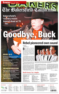

The Bakersfield Calfornian launched its visually dramatic redesign on March 1. Early results are overwhelmingly positive.

According to Executive Editor Mike Jenner, subscription starts are up 15-1 over stops and single-copy sales are up 8-13%. Classified Advertising Manager Sally Ellis reports a jump of one thousand additional inches of advertising in the redesigned Real Estate tab.

These numbers are particularly gratifying because Bakersfield's redesign is not typical of the facelifts that most American newsapers undergo. The Calfornian took some risks, choosing change with a capital “C.”

This redesign began more than a year ago with a phone call from Jenner to Brass Tacks Design. Jenner said, “We're not interested in merely rearragning the deck chairs.”

As someone who cares about newspapers and design. this is exactly what I love to hear. The next thing I heard was much more daunting.

“The prototype you deliver should make me saw “Wow.” This admonition came from Richard Beene, president & CEO of The Calfornian, its former editor and Jenner's current boss.

So that was our task – to make a 30-year veteran of the newspaper business say “Wow!” about our proposed changes for his newspaper.

Where do you begin? How do you impress someone who has probably seen it all?

First, you do the research. We reviewed the quantitative research conducted by American Opinion Research (AOR); we gathered qualitative reseach by conducting focus groups on site with readers; we met with all stakeholders in editorial, advertising, circulation and corporate; and we toured the market to see what it looked like to the people living there.

We learned what was unique about the Bakersfield market. This informed our design strategy.
  • Bakersfield is the reddest spot in the bluest state.
  • Bakersfield had the second hottest real estate market in the United States.
  • Families were moving to Bakersfield because it offered some of the most affordable housing in California.
Next we considered the conventional wisdom about newspaper design – and ran in the opposite direction. Here's how the redesign of the Bakersfield Californian (TBC) defied the Conventional Wisdom (CW):

Story play
CW: The most important stories get the best play
TBC: Importance is merely one consideration. Stories that are relevant, compelling and/or interesting deserve equal consideration.

Use of color
CW: Create a color palate of soft, subtle shades that reflect the community
TBC: Liberally splash bright, intense colors across section fronts

Headline typography
CW: Pick a modern interpretation of an elegant, Oldstyle serifed font for headlines, then use a sans serif head on no more than one story per front.
TBC: All heads use a simple sans serif font

Placing main art above the fold
CW: Make sure the main art appears above the fold on fronts
TBC: There's plenty of art in the nameplate and section flags, so there's no need for lead art – above the fold or anywhere else.

Use of photography
CW: Every page should have a dominant element probably a large photograph
TBC: Photos cropped for impact need not be particularly large to communicate

Goals
“When we embarked on this project, we set out some important goals,” said Jenner.

“First, we wanted our front page to be striking – even arresting. The new look involves design techniques more commonly found in magazines than in most newspapers, but quality photographs and the ability to print great color are two of our strengths. We think the new approach makes the page more visually appealing.”

“Second, we wanted to address the issues of time-starved readers. More and more readers tell us their lifestyles are busier than ever before. Many aspects of this design address this reality.”

Two months after our initial meetings I returned to Bakersfield armed with nine prototype pages based on nine published pages. We spread the befores-and-afters on the floor of a conference room. Richard Beene walked in at 10:00 a.m. At 10:01 we heard what I traveled coast-to-coast to hear – “Wow!”

Then the real work began – turning this redesign into a reality. We worked with the staff to produce more pages. We built an entire prototype edition, revisiting every editing decision on every page to produce a better Californian.

Then we shared this prototype with focus groups so they could compare an actual, published edition with our new vision for the paper.

Focus groups of advertisers overwhelming preferred the new design. Readers differed in their opinons. Many readers thought the front page had gone too far. Other readers, particularly younger ones, preferred the new design overall. One woman said, “I used to subscribe but I stopped. I'll resubscribe if I can get the paper in this new format.”

That's focus group gold.

Adjustments and improvments to design and content were made during the winter. The new design was launched March 1.