
From COLUMBIA JOURNALISM REVIEW, March/April 1996

Let's get small

When newspapers really downsize

By Michael Casey

Sometime in the fall of 1997 there will be less of The Washington Post. Michael Clurman, the paper's production vice president, says the newspaper will shrink then by an inch in width (to twelve and a half inches), and by an inch and nine-sixteenths in length (to twenty-two inches). Multiplied by all the pages in a typical newspaper, that's a lot of lost space; multiplied by The Post's circulation of nearly 800,000, it also means much less newsprint. "Millions of dollars," Clurman says.

The Post is not the first to get smaller, but it is the first U.S. big-city daily to do so. It may not be the last, even though newsprint prices, which are cyclical (see "Paper Trail," CJR, July/August), are widely thought to be heading down. "There is continued pressure on news paper profitability and, as new sources of revenue continue to be more difficult to find, prudent cost management makes sense," Clurman says. "Newsprint plays such a major role in producing a newspaper. This will not go away."

Several Canadian papers, including The Toronto Star, have shrunk themselves. The pioneers in the U.S. seem to be two small dailies - the North Jersey Heraldi & News, in Passaic, New Jersey, and The Express Times, of Easton, Pennsylvania - both owned by William Dean Singleton and Richard Scudder, who own the Denver Post, among other newspapers. Publisher Richard Vezza says newsprint costs for his Herald & News and some sister weeklies had nearly doubled over the last two years, and he had little choice. "Would you rather reduce the paper or reduce the number of reporters who write the stories?" Vezza asks. "Which one would be more beneficial to readers?" The Herald & News cut an inch in width, from thirteen and a half to twelve and a half inches.

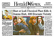
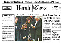
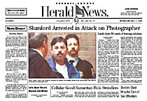
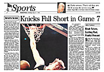
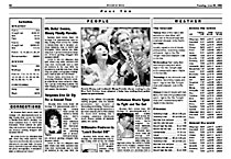
If trimming the paper is lemons, the Herald & News made lemonade. Along with the smaller page size, the paper introduced a drastic but graceful redesign last October that harked back to its traditional roots - fewer and smaller photos, less white space, narrower columns, smaller type. Gone were the bold masthead, blue border lines, and loud headlines. Vezza told designer Alan Jacobson that he wanted to retreat from the graphic "arms race." "Newspapers were becoming just another product that screams at people," Vezza says. "We seemed more interested in entertaining people and being graphically appealing than being serious."

The redesign actually left the Herald & News with a larger news hole than before, and the ability to put more stories on page one. Except for the smaller body type, Vezza says, reader reaction so far has been posi tive. Advertisers have not complained, and the paper has saved hundreds of thousands of dollars.

Such a drastic redesign may be rare, however. And although the savings will be hard to resist, there are risks. Media analysts at Lynch Jones & Ryan, in the firm's Newspaper Newsletter, argue that this kind of downsizing could cause "permanent harm to newspapers," giving the traditional broadsheet newspaper a long and skinny look at the expense of news hole and at the risk of offending advertisers, who are likely to see themselves receiving less for their money.

The Post is planning a redesign, Chruman says, and its editor and publisher are currently negotiating what the impact of the smaller paper will be on the amount of space devoted to news. Readers and advertisers will finally decide if less can be more, or at least about the same.
|
|

|
• Click on any image to see more.








|
|
|
|