|
|
|
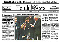
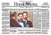
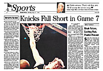
From DESIGN, Winter 1995 A designer's perspective The redesign of the Herald & News By Alan Jacobson, Brass Tacks Design Imagine yourself beginning a newspaper redesign. You sit at your all-powerful Macintosh with a vision limited only by your imagination and the wishes of the publisher. Sound like fun? Now consider Publisher Rich Vezza's wish list for the redesign of the Herald & News: No color. No graphics. No logos. No promos. No white space. No more than one photo per page. And while you're at it, reduce the page width from 13" to 12" and increase the story count. Still sound like fun? As it turns out, it was. Because Rich empowered me to change anything and everything to meet his goals, as the following illustrates: Several days after our first meeting Rich called me with a description of a dream he had the previous night. In the dream I was showing the redesign prototype for the first time. He reacted by saying I hadn't gone far enough something I have never heard from a client. Rich's challenge to "go too far" was just the incentive I needed to make this project fun. His wish list bucked the industry trend, but I believe there is a method to his madness. The 50,000-circulation Herald & News in Passaic, N.J., is struggling in the highly competitive New York metro market. Their chief competition is The (Bergen) Record with more than 220,000 circulation. The Record displays the excellent color, modern layout, typography and graphics common among newspapers that embraced the newspaper design revolution. In contrast, the limited resources of the Herald & News made it difficult for them to achieve the same quality of presentation. The Herald & News consistently appeared second-rate. Rich knew he could not compete with The Record. So he proposed a design approach that would reposition the Herald & News as "the newspaper for people who like to read newspapers." My work began after we reached agreement on these goals for the redesign: The Herald & News should be information packed, with each inch of newsprint used to maximum effect. The graphic presentation should communicate a thoughtful, serious tone. The design should be easy for editors to follow, providing more time for headline writing, copy editing and story selection. Stories and briefs should be short and to the point, respecting the busy lifestyles of readers. These words formed the verbal foundation for the redesign. As a visual reference, Rich gave me a bound volume of yellowed, crumbling pages from the now-defunct Elizabeth (NJ) Daily Journal of 1934. "This is what I want," he said. The 1934 Elizabeth Daily Journal was 16.5" wide. A typical front page contained 21 stories with three jumps, no photos other than a few one-column mugs, and no headlines larger than 48pt. Gray. Very gray. Could this truly be what Rich wanted? More importantly, was this in the best interest of his newspaper? I weighed his wishes against my knowledge of readers' wants and needs, which have changed significantly since 1934. I didn't agree that the Herald & News should abandon color and limit photos because today's readers expect news photos in color, and more than one photo per page. Taking this exception from Rich's wish list, the design work began. I produced six prototype pages drawing stories and photos from published pages. All heads were rewritten to reflect a more serious, straight-forward approach. Feature centerpieces were eliminated and replaced with hard news stories. Story count was increased from five display stories per section front to seven. Section fronts also saw the addition of a column one rail, which increased the headline count even more. Photos were re-edited, down-sized and cropped more effectively. Removing all distracting spot color increased their impact. These steps recast the content to match the new editorial philosophy. Typographically, the prototype took on the trappings of an old-style newspaper. Headlines were limited to 48pt. on news pages. Helvetica Bold and Times Roman headlines were replaced with Century ITC and News Gothic headlines. All heads were set upstyle rather than upper-and-lower. Art heads were eliminated. Ionic #5 was introduced as bodytype. The light and elegant nameplate of the 1878 Passaic City Daily News was resurrected to replace the sans-serif nameplate of the 1980s. Other changes in appearance followed. Layouts became more vertical and less modular. Column rules and cutoff rules replaced boxes. Column widths were narrowed. The front-page American flag printed in garish spot color was replaced with a black-and-white drawing from many years ago. And virtually all contemporary design bells and whistles were eliminated. These first six prototype pages were enthusiastically received by Rich and his editors. Two more rounds of prototype pages were produced in the same style, with every page scrutinized for adherence to the new, visually austere philosophy. Even the map from the weather package was eliminated, resulting in a weather report with absolutely no graphics. The redesign was launched Monday, October 2nd two days before the Simpson verdict and three days before the Pope's visit to North Jersey. The competition used oversized, tabloid-style label heads and feature-style layout on these stories.The Herald & News used informative, straight-forward headlines and presentation. Readers and staffers said the new design gave the Herald & News more credibility. |
|