|
|
|
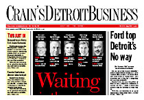
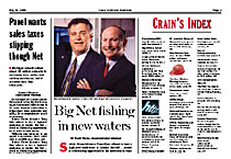
“We imposed on Brass Tacks Design the burden of creating a new look for a publication that its readers loved. What we got was an elegant newspaper that finally looked like a business publication. The new flag looks wonderful. Even now, nearly two years later, I could just weep with joy. Reader response to the redesign was almost unanimously positive. The entire staff, editors and reporters alike, love it. Speaking as an editor, it is easier to write headlines. Speaking as a designer, it's almost impossible to create an ugly page, thanks to the headline typography. And if you apply yourself, you can create pages that make you look a lot more talented than you probably are. The true test is that our inside pages sometimes can look as good as our display pages. This design allows the nature of the news to determine the design of Page 1 – no more of that "dominant-art-of-white-guy-in-suit" stuff. And, no, we didn't sacrifice anything on deadlines. Nor did the quality of our reporting and editing suffer as a result of the changes. Alan didn't merely give us what we wanted. He had us take a hard look at many of our assumptions about the way we did things. The process wasn't stress-free, but it was educational and, more often than not, fun. We began this project with the goal of looking informative while remaining informative. Mission accomplished.” Bob Allen, AME/Design |
|