AUGUST 17,2009

Bakersfield: Weekday tab, weekend broadsheet
To boost the bottom line, newspapers must push beyond everyone's comfort zone, including readers, advertisers and journalists. This strategy worked in Wilson, N.C. and we believe it will work in Bakersfield.
In May 2009, we launched a redesign at The Wilson Times over the
objections of readers and advertisers. The redesign increased ad revenue by six figures, boosted single copy sales and doubled the rate of subscription starts.
In Bakersfield, we applied some lessons learned in Wilson, then went even further to boost revenue and cut costs. Bakersfield's redesign will reduce newsprint consumption, reduce production time in editorial and increase revenue:
- Saving newsprint: Full-page ads are few and far between during the week, so it makes sense to produce newsprint-saving tabs during the week and broadsheets on the weekend.
- Saving newsprint: A tab has more heft than a thin broadsheet, so a tab seems more substantial and masks the overall reduction in newsprint. Newsprint consumption can be reduced by 25 percent in a tab format without making the paper seem too “thin”.
- Saving newsprint: Newspapers devote too much space to wire copy and feature photos that have limited value to readers. Reducing both saves newsprint.
- Boosting revenue: Readers will tolerate more front-page advertising if the ads are useful to them. So we focused on coupons.
- Boosting revenue: Readers will tolerate more prominent display of advertising if the ads don't interfere with the usability of the newspaper. So we increased the amount of space devoted to advertising on marque pages, and restacked the ads throughout to provide a cleaner look for advertising and editorial.
- Boosting revenue: Tabs provide more color positions, including the option to run all pages of classifieds in color. Adding color to classifieds is a major revenue opportunity.
- Saving time: Newsrooms spend too much time on labor-intensive page design. So we streamlined the design to make better use of manpower. Streamlining the design also reduces visual competition between editorial and advertising.
The most obvious change was converting the Monday-through-Friday edition to tab, but keeping the broadsheet format on Saturday and Sunday. A less obvious change was a return to the 54-inch web.
And here's the most interesting thing we learned: Readers and advertisers understand that newspapers are challenged by today's economic realities. They want their local newspaper to survive. They made this point in every focus group. They told us they would tolerate changes – even those that they objected to – if those changes allowed the newspaper to stay in business.
Why a tab makes sense now
Back in 2006, I explained
"Why tabs won't play in the USA." But times have changed. Now I'm advocating the tabloid format.
What has changed in the past three-and-a-half years?
Everything.
Full-page ads have almost disappeared on weekdays, so there is little need for a broadsheet format every day
Tabloids didn't materialize en masse in the U.S. because they didn't make dollars and sense. In 2006, newspapers were deriving significant revenue from full-page ads from realtors, retailers and car dealers. Converting to tabloid format in 2006 would have produced a significant reduction in advertising revenue, according to Art Wilkinson, executive director of the International Newspaper Association of Marketing Executives (INAME).
But today, many of those retail department stores have disappeared via consolidation, and car dealers have cut back on full-page ads in favor of more cost-effective, online advertising with cars.com and autotrader.com.
So there is no need to preserve the broadsheet format on most days of the week because there are no full-page ads Monday-Friday. Car dealers and realtors continue to run full-page ads on the weekend, so the Californian will publish in broadsheet format Saturday and Sunday. This is one of the many ways in which the Californian is changing the game, by adjusting its format to meet market demand.
Today's broadsheet pages are a mess: Tabs provide an advantage.
Most full-page ads have been replaced by smaller, 2-col ads. And as newsholes have shrunk, longer stories have been replaced by shorter ones. Broadsheet pages that once showcased large ads and longer stories are now crammed with many more smaller ads and shorter stories, making once-proud broadsheets look like poorly organized shoppers.
Newspapers need to “right size” their pages for the ads and stories they publish today. Smaller ads and shorter stories look better on smaller pages.
Cost savings by reducing newsprint consumption: Tabs provide an advantage.
All newspapers have reduced the number of pages they print. As the paper becomes thinner, it loses "heft," and as a result, it may lose the confidence of readers and advertisers as a viable, credible and authoritative source of information.
In Bakersfield, we rebuilt a weekday broadsheet edition in tab format, with 25 percent less newsprint. Then we let readers compare the two versions head-to-head. No one said the tab version was less substantial than the newsprint version. Some readers and advertisers claimed that the tab version seemed to have more heft, even though it used less newsprint. This indicates that one thick tab section is better than 4-6 thin broadsheet sections.
Cost savings by making better use of pages: Tabs provide an advantage.
In a broadsheet, each category of content must fit within its section. For instance, local news must fit within the local news section, sports news must fit within the sports section, etc. Invariably, some sections are too tight while others are too loose. To add space in a particular section, many pages must be added to balance the press. It's impossible to add one-half of one broadsheet anywhere.
Unless you publish in tabloid format.
With a tab, you can add a single tab page from sports by borrowing it from elsewhere in the folio, but without the need to increase the newsprint consumption. So a tabloid format provides a far more efficient means for allocating newsprint for news content.
New revenue from new advertising opportunities: Tabs provide an advantage.
The redesigned Californian has many new advertising opportunities: front page, first page of sports, first page of entertainment, tv, comics and the back page. According to John Wells, Bakersfield's VP for advertising, these new advertising positions should increase total advertising revenue.
While editors may bristle at ads on these marque pages, consider this:
- Ad positions now occupy 25 percent of the front page and sports cover at The Wilson Times. Since launching its redesign in May, ad revenue is up, single-copy sales are up and monthly subscription starts have doubled.
- Readers will tolerate front-page advertising, if the advertising is useful to them. So we focused on coupons for everyday items, such as food and dry cleaning.
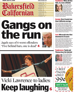
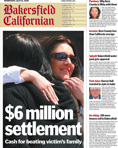
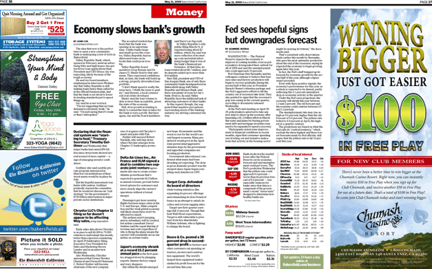
- Historically, most U.S. papers devoted more than half their front pages to advertising. See a front page from the Californian, below, with ads in cols. 4-6, both above and below the fold.
New revenue from color: Tabs provide an advantage.
The Californian can print up to 64 tab pages in full color. That means a full-color ad can appear on any page –Ýsomething that isn't possible in a broadsheet.
But more importantly, color can now be offered every day as an upsell in classifieds. According to Michele Hatfield, Bakersfield's classified advertising director, the addition of color to classifieds should boost advertising revenue.
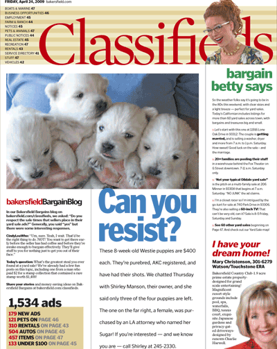
To further enhance the profile of the classified franchise, the back of the tab has been turned over to stories about each day's classifieds, reverse-publishing of a local online blog about classifieds, and a sponsored advertising position in the lower right corner.
 New revenue from single-copy sales: Tabs provide an advantage.
The front page of any broadsheet contains more 9pt. text than anything else, even though no one believes this text drives impulse buys. In contrast, most tabs consist of big photos and big headlines which are more likely to get the attention of an impulse buyer. According to Michael Boody, Bakersfield's circulation director, the redesigned Californian should increase single copy sales.
 A new design philosophy for editorial and advertising
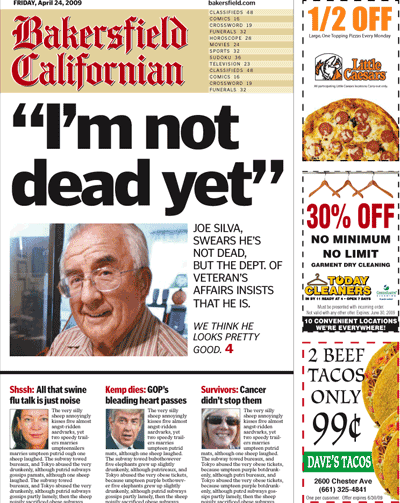
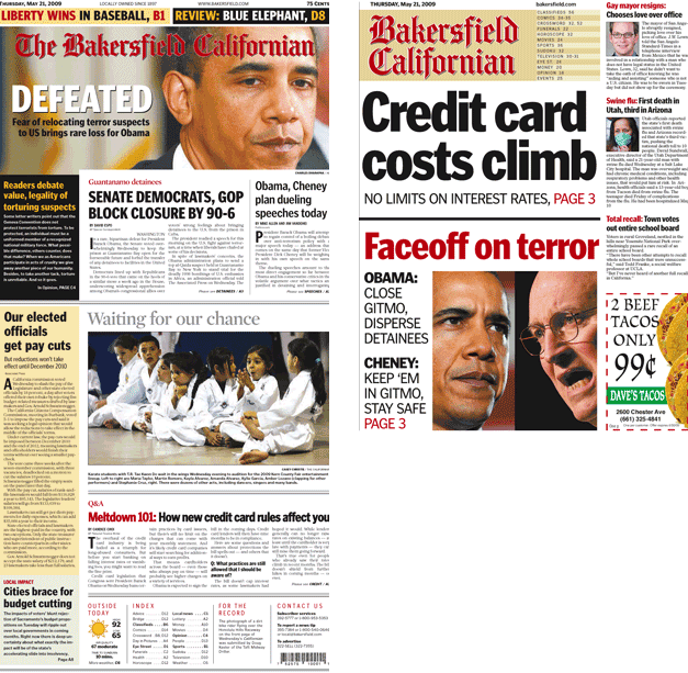
The Californian's old design was possibly the most labor-intensive in the U.S. Now it is the least labor-intensive. Most headlines are the same size; Spot color has been eliminated except for color-coded section labels; Photos have been eliminated, except those that truly inform and have news value. Note that the cover, below, has no dominant image.
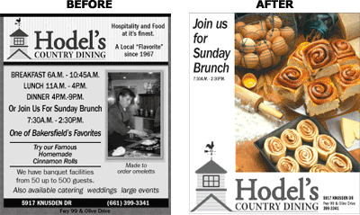
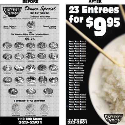
We “quieted down” the editorial design to give more visual emphasis to the full-color ads on every page. And we worked with the advertising designers to calm down the ads, too. In most cases, we removed bright and garish backgrounds from ads and encouraged ad designers to use more white space. Befores-and-afters of redesigned ads appear below.


We changed the ad stack, too. Now ads are stacked on the outside of pages: On left-hand pages, ads appear on the left side; On right-hand pages, ads appear on the right side. And in both cases, ads are stacked higher on the page to give them greater visibility.
 Cost savings from elimination of non-essential content
Most readers in most markets buy the paper for local news, so newspapers should reduce or eliminate news from the nation and world. Furthermore, stand-alone feature photos consume a disproportionately large amount of space for the news content they deliver. Newspapers should reduce wire copy and eliminate feature photos to cut costs.
Restoring the 54-inch web
When the industry zigs, Bakersfield zags –Ýthey're going back to the 54-inch web. Here's why:
For the past 15 years, newspapers have been reducing their web widths to reduce newsprint costs. These conversions have created narrow broadsheets approaching 10 inches wide, and consequently, short and squat tabs that are roughly ten inches square.
No one likes these square tabs. They're aesthetically unattractive, but more importantly, they limit the height of display ads.
So the Californian will print in two different formats each week to maximize revenue and reduce cost:
- On Monday-Friday, it will print a tab on a 54-inch web. Each tab page provides 30 percent more advertising space per page than a square tab printed on a 46-inch web.
- On Saturday and Sunday, it will print a broadsheet on a 46-inch web to limit the cost of printing broadsheet pages, while providing the broadsheet format to advertisers on the days they want it most.
What readers and advertisers told us
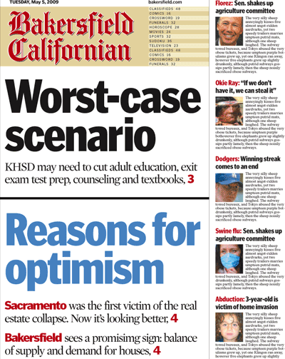
In pre-launch testing, half the readers preferred the tab to the broadsheet. In particular, they cited the handiness and convenience of the tab. You can see the front pages they saw, below. The other half preferred the broadsheet with its sectioning.
(See more about that issue, below.).
Advertisers had a single concern: audience. The format didn't matter to them as long as it didn't matter to readers.
But these specific issues are overshadowed by a more important one: Regardless of whether they preferred the tab or the broadsheet, readers told us they would continue to subscribe and advertisers told us they would continue to advertise. So we felt confident in deploying our strategies for increasing revenue and cutting cost, without fearing a reduction in readership and revenue.
Coping with complaints about sectioning
In pre-launch testing with readers and advertisers, the lack of sectioning was the single biggest objection to the tab format. There were two specific complaints:
- Navigation: "I can't find the local news section."
- Sharing: "I can't share the paper with my spouse over breakfast."
After the focus groups, we moved the local news content to the front of the book to make it easier to find. And we added a color-coded front-page index and color-coded labels to every page to enhance navigation.
We didn't tell the focus groups that the Californian would become a two-section paper some days of the week if it didn't convert to tab, so sectioning would be reduced one way or the other. And we didn't tell them that it would have broadsheet sections on Saturday and Sunday – when sectioning has more practical value. So sectioning may have been less of an objection in focus groups if they had known this.
But to address the concern about sharing, COO Logan Molen, came up a brilliant solution: For those subscribers who want to share a paper in the morning, the Californian will deliver a second copy of the paper at a marginally higher cost.
Keys to designing for the bottom line:
- Reduce newsprint consumption.
- Sectioning should be eliminated, in favor of a magazine-like flow of content, which makes better use of newshole.
- Editorial designs should be simplified to expedite page production.
- New advertising opportunities should be created on all pages.
- Wire news should be reduced or eliminated to preserve newshole for local news.
- Non-news photos, such as stand-alone feature photos, should be eliminated to save space and make better use of news photographers' time.
- Editorial designs should not be dependent upon display photos which consume newshole.
